“
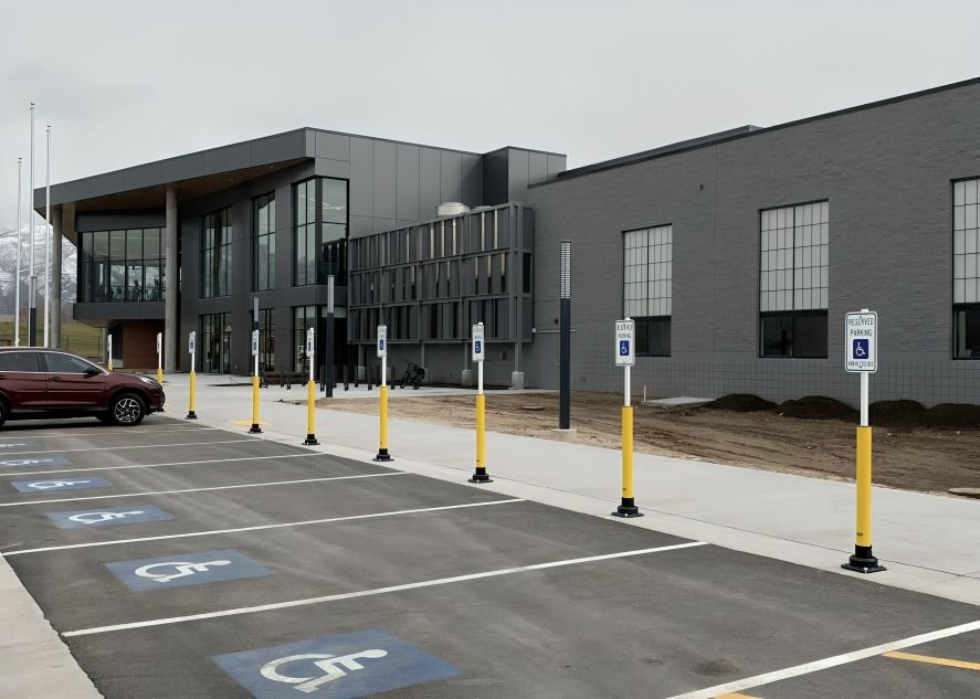
Properly designated Handicap Parking spaces are crucial for accessibility, allowing individuals with disabilities to park conveniently. This guide introduces the significance of these spots and the regulations ensuring they are used correctly. Discover facts about Handicap Parking signs, its Regulations and Requirements! A complete guide for curious kids.1
1
”
The International Symbol of Access was designed in 1968 by Danish student Susanne Koefoed to improve accessibility for people with disabilities. It was officially adopted by the International Organization for Standardization (ISO) in 1969. 1
Koefoed's original design depicted a figure in a wheelchair with a focus on clarity and ease of recognition. This symbol was intended to be easily understood across different languages and regions. Its adoption marked a significant step in accessibility advocacy.2
A handicap parking space must have a slope no steeper than 1:48. This ensures accessibility and ease of use. Compliance with this standard is essential for accommodating individuals with disabilities. 3
The International Symbol of Access is used globally on signs, parking spaces, and building entrances to indicate accessible facilities and services. Its widespread use helps ensure that individuals with disabilities can find and use necessary resources. 4

A handicap parking space must be at least 96 inches wide. It should have an adjacent aisle that ranges from 60 to 96 inches. These dimensions ensure accessibility for individuals with disabilities.
The symbol has influenced legislation related to accessibility and inclusivity in public spaces. Its adoption has contributed to the development of laws that mandate accessible design in buildings and infrastructure. 5
In most areas, handicap parking sign post regulations do not apply to spaces designated exclusively for delivery vehicles, buses, commercial trucks, vehicle-in-town lots, or law enforcement vehicles. 6
The symbol is standardized in terms of design and color, featuring a blue background with a white figure. This consistency helps ensure that the symbol is easily recognizable regardless of location. 7
The International Symbol of Access has been used in international conferences and advocacy campaigns to promote disability rights. Its visibility in such forums helps advance the conversation about accessibility issues. 8
The symbol has been integrated into digital platforms, including apps and online tools, to indicate accessible features. This modern adaptation ensures that accessibility information is readily available in the digital age. 9
The symbol serves as an educational tool in teaching about disability awareness and accessibility. Its use in educational materials helps raise awareness and understanding of accessibility issues. This role supports efforts to foster a more inclusive society. 10
Modern adaptations of the symbol include variations for specific needs, such as visual or hearing impairments. These adaptations aim to address a wider range of accessibility requirements. They help ensure that the symbol remains relevant to diverse needs. 11
The symbol's design has remained simple yet effective in conveying its message. Its clarity allows for quick recognition and understanding, which is crucial in emergency and everyday situations. This simplicity is key to its widespread adoption. 12
The International Symbol of Access has become a symbol of advocacy for improved accessibility. It is often featured in campaigns and initiatives aimed at enhancing public understanding of disability issues. 13
The symbol's consistent use across various platforms helps create a unified approach to accessibility. Its presence on signs, online, and in legislation reinforces the importance of accessible design. This unified approach aids in achieving broader accessibility goals. 14
The forward-leaning design of the symbol represents not just access but also the independence and mobility of individuals with disabilities. This design change reflects a more empowering view of disability. 15
The symbol has been adapted for use in various contexts, including transportation and public spaces. These adaptations ensure that accessibility information is available across different environments. The symbol's versatility supports its effectiveness in diverse settings. 16
Its use in public and private spaces helps to signal the availability of accessible facilities and services. This visibility supports individuals in finding suitable accommodations and resources. The symbol's role in guiding accessibility helps improve quality of life. 17
The symbol has inspired similar designs for other types of accessibility needs, such as visual or auditory impairments. These related symbols help create a comprehensive system for representing different disabilities. 18
Future developments in the symbol may focus on further enhancing its representation of diverse abilities. Ongoing discussions aim to ensure that the symbol continues to meet evolving needs. 19


